Yes, it’s hyperbolic, but it’s not wrong
I recently saw the following tweet comparing the Canadian and US housing markets.
As an American Canadian permanent resident who experiences this phenomenon acutely, I was naturaly interested. What particularly got my attention was the claim in one of the comments that this was “70% Toronto and Vancouver”. I thought, “I wonder if I can verify that…”.
So I went to the Statistics Canada website and found the New housing price index which has monthly data on the cost of new housing going back to 1981 for 26 cities across the country. I downloaded the data and got to work to see if I could get an idea of how much of the insane increase in the cost of housing in Canada comes from its two main cities.
First step: data cleaning. Not too bad - after a bit of manipulation in the Stats Can data portal, I got the data in a relatively clean and friendly format. Accounting for extra header and footer rows, I was able to load up a DataFrame without issue. I had to fill in some missing data where appropriate and create some new fields, but so far so good. Now I’m just about ready to make some plots. Easy, right?
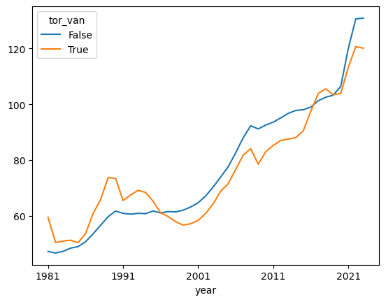
Kind of. Certainly not very intuitive and complete nonsense for a beginner. Here’s my one liner to chart the average indexes for Toronto and Vancouver vs. all other Canadian cities1:
df[['year', 'houses', 'tor_van']] \
    .groupby(['year', 'tor_van'], as_index=False) \
    .mean() \
    .pivot(index='year', columns='tor_van', values='houses').plot()
Here’s what we get:
Maybe this is a small price to pay for reproducibility, embedability (not a word), and the ability to say you are a Coder, but there is a large amount of upfront investment required to write that command.
Next I got interested in what the trends looked like for individual cities. Easy to switch out the tor_van field for a city field and produce a chart. Unfortunately the default styling makes the chart completely illegible. It’s too small, the legend totally overlaps the chart, and colors repeat so any given color could be one of three cities. There are at least three styling flaws that need to be fixed.
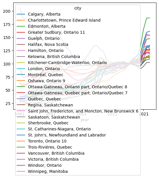
This is where the headaches really begin. Python’s main plotting library, matplotlib, has a very steep learning curve. I remember weeks lost at a previous job trying to get a suitable chart for executive presentation. ChatGPT didn’t exist back then, and I was pretty impressed at how quickly it helped me to resolve many of the issues I was having, but this process still took well over an hour. The results weren’t bad, but took a while. Without GPT4, I could have easily lost a day to this.
Enter excel, everybody’s favorite data tool to hate. I switched over to investigate some missing values that I discovered in this process. I wanted to confirm that the results I was getting weren’t a result of improperly cleaned data, so I decided to do some quick plots while I was there. Fifteen minutes and as many clicks later, I had a plot that was just as good as my final matplotlib plot, if not better2.
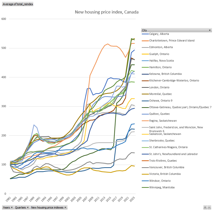
Contrary to the title, the moral of the story here is not that python sucks at visualization and Excel is better. Rather, it’s that different tools have different purposes. In this case of a simple one-off analysis with clean, small-ish data, Excel was the better tool. If any of those characteristics changed, it’s likely that a different tool would fit the use case better.
This post isn’t about the results of my analysis, but I was surprised to find that not only are Toronto and Vancouver not responsible for such a huge increase in housing cost, but that prices have increased in these cities much more slowly than other Canadian cities. If you are interested in seeing my messy-ass notebook, you can find it here along with the data (and the excel notebook I used). ↩︎
I have to say though, there was at least one thing about this that I found absolutely maddening. I couldn’t find a better way to save the chart than to take a screenshot. Maybe it was my version of Excel, but there was literally no way to export the chart as an image file, which is pretty ridiculous. ↩︎